


The "After 'The
End'" series began with a few considerations about cover design.
Continuing the topic will include examples of the thoughts that went into a
specific cover design--and the resulting cover.
The first two examples are non-fiction. Deciding on a design was easy. The publisher had a standard template so fonts, layout, and colors were preset. However, that does not mean creating the final product was easy. The central image needed to be selected.
Hundreds of images in the collection had to be narrowed down to the five presented to the publisher, who would have the final word. In the case of the first example, since the state of electronic scanning was still developing, the original photographs would eventually be driven to North Carolina.
Among the considerations that went into the selection were visual interest and how the image represented the topic of the book. The picture had to be unique. In other words, it could not be in common use, such as in a calendar or as important, used within the book itself.
Many pictures that met the previous criteria came up short on the final selection requirement--quality. Many of the eye-catching images had too many losses. In far too often a case, chunks of the picture no longer existed, which meant extensive restoration. Two things that were beyond time and budget limitations.
Other pictures might have been intact, but had insufficient crispness. When offset printed, details would have been lost and/or the image blurred.

The reverse tact was taken in the second example where the picture was selected because of the more panoramic view. Click on the appropriate title for more information on Around Matawan and Aberdeen or Of Town and Field: Matawan and Aberdeen.
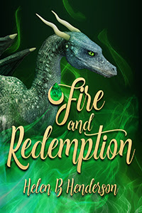
Next post -- What
went into the fantasy covers for the first two books of the fantasy series, the
Dragshi Chronicles.
Till next time ~
Helen
No comments:
Post a Comment
By posting a comment on this site, you agree with the site's Privacy Policy on how your data is stored and handled.